푸딩이야기
상단바를 꾸며보자! 본문
테마작업의 첫단계 상단바를 꾸미자!
위에서부터 아래로 설명 해보겠습니다. (아이언 기준으로 했으면 베가기종이여도 차이가 있을수 있으며 타 s사 l사 등과는 맥락은 비슷하나 많이 다를수 있습니다.)
자 상단바 일단 알림이 오는것과 별개로 통신 배터리등등 상태부터 시작해서 시계 등등 많죠.
아이콘은 그냥 이미지 교체라서 생략하겠습니다. (후에 이미지 수정 관련 글도 올리죠ㅎ)
일단 킷캣이상은 그란데이션이 기본으로 적용 되어 있습니다.
다만 그렇지 않다면...?

일단 이걸 수정해주기 위해 싯유를 뜯어야 합니다
디컴파일은 http://puddingstories.tistory.com 를 참고 하세요.
물론 그란데이션이 이미 되어 있는 경우 불필요 하지만. 안되있다면 베가 기종에 한해 이렇게 수정 가능 합니다.
싯유를 뜯은곳으로 가서 res/layout 에 status_bar.xml 를 열어 수정해주면 됩니다.
수정에 필요한건 notepad++ 인데 가서 다운 받으시면 됩니다.

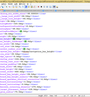
-<com.android.systemui.statusbar.phone.PhoneStatusBarView xmlns:systemui="http://schemas.android.com/apk/res/com.android.systemui" xmlns:android="http://schemas.android.com/apk/res/android" android:descendantFocusability="afterDescendants" android:fitsSystemWindows="true" android:focusable="true" android:background="@drawable/system_bar_background" android:id="@id/status_bar" android:orientation="vertical">
에 주황색 부분을 바꿔주면 됩니다. drawable xhdpi 뭐 이런곳에 그란데이션 한 이미지 파일을 넣고 위에처럼 이름을 맞춰서 수정해주어도 되고.
그란데이션 필요없고 색깔로 맞추고 싶다! 하면 그냥 색상값 넣어서 해주어도 됩니다.

자 상단바가 끝~!
그렇다면 내려서 나오는 것도 예쁘게 맞춰줘야 겠죠>..?
자 이쪽 배경. 한번 바꿔 볼까요..?

다시 싯유 res/layout 쪽으로 가줍니다.
status_bar_expanded_header.xml 를 열어줍니다.
가면 대충 이런식으로 위쪽에 있는데. 노트패드로 열었을때 2줄에 있습니다.
-<LinearLayout xmlns:systemui="http://schemas.android.com/apk/res/com.android.systemui" xmlns:android="http://schemas.android.com/apk/res/android" android:baselineAligned="false" android:layout_height="45.0dip" android:layout_width="fill_parent" android:background="#22000000" android:id="@id/header" android:orientation="horizontal" android:gravity="center_vertical">
색칠해놓은 부분을 수정해 주시면 됩니다. 그리고 유의 사항이 하나 있는데.
시계 설정 아이콘들 쪽에 배경이 있는데 이건 이미지를 수정하거나 색상값으로 대체하면 될듯 합니다.

그리고 경계선들이 보이는데 이걸 없에주거나 바꿔 주고 싶다~ 이러면
<View android:background="@drawable/noti_panel_divider" android:layout_width="fill_parent" android:layout_height="1.0dip" />
주황색은 색깔 바꾸고. 파란색은 높이인데 이걸 늘려서 경계선을 뚜렸하게 하거나.
0.0dip 로 맞추어 경계선을 없엘수 있습니다.
자 그러면 이제 바로밑에 있는 녀석 배경도 알아 봅시다.

res/layout에
status_bar_easy_setting_scroll.xml 를 수정하면 됩니다.
-<LinearLayout xmlns:pantech="http://schemas.android.com/apk/res/com.android.systemui" xmlns:android="http://schemas.android.com/apk/res/android" android:splitMotionEvents="false" android:layout_height="wrap_content" android:layout_width="fill_parent" android:background="#25000000" android:id="@id/status_bar_easy_setting" android:orientation="vertical">
색칠한 부분을 수정해주면 됩니다.

여기도 수정해줍시다. 잘은 기억 안나는데... 이것도 수정해줬습니다.
아이언 기준으로 60번쨰 줄에 있네요.

자 밝기 투글을 한번 봅시다.

res/layout에
status_bar_expanded.xml 를 수정해주면 됩니다.
<LinearLayout android:orientation="vertical" android:id="@id/brightness_panel" android:background="#25000000" android:layout_width="fill_parent" android:layout_height="67.0dip">
여기도 색칠한 부분을 수정!

자 알림 타이틀? 이라고 하죠. 이부분도 한번 보죠.

res/ layout에
status_bar_expanded_notification_title.xml 을 수정!
대충 이렇게 되어 있는데.
<RelativeLayout android:layout_gravity="center_vertical" android:orientation="horizontal" android:background="#00000000" android:layout_width="fill_parent" android:layout_height="30.0dip"
중간 생략;
<View android:id="@id/notification_title_divider" android:background="#00000000" android:visibility="gone" android:layout_width="0.0dip" android:layout_height="0.0dip" android:layout_marginTop="0.0dip" android:layout_marginBottom="4.0dip" android:layout_toLeftOf="@id/clear_all_button" />
</RelativeLayout>
색칠한 놈들을 바꿔주면 됩니다!

자 이쪽 배경은 알림 배경 말고 알림의 뒷배경이죠.

res/layout
status_bar_expnaded.xml 를 보면
<com.android.systemui.statusbar.phone.NotificationPanelView android:id="@id/notification_panel" android:background="#00000000" android:paddingTop="@dimen/notification_panel_padding_top" android:layout_width="fill_parent" android:layout_height="fill_parent" android:layout_marginStart="@dimen/notification_panel_margin_left"
색칠한 부분을 수정!

그러면 이제 밑에 있는 녀석을 한번 보죠?
어 이게 배경이 있었나? 네 있죠. 검은색이죠?

res/layout에
status_bar_notification_row.xml를
<Button android:gravity="end" android:id="@id/veto" android:background="@null" android:layout_width="48.0dip" android:layout_height="fill_parent" android:paddingStart="8.0dip" android:paddingEnd="8.0dip" android:layout_marginEnd="-80.0dip" />
연두랑 주황 지우시거나.
주황을 수정해주면 됩니다.

res/layout에
carrier_label를
<?xml version="1.0" encoding="utf-8"?>
<TextView android:textAppearance="@style/TextAppearance.StatusBar.Expanded.Network" android:gravity="center" android:layout_gravity="center" android:id="@id/carrier_label" android:background="#00000000" android:paddingTop="3.0dip" android:paddingBottom="3.0dip" android:visibility="visible" android:layout_width="fill_parent" android:layout_height="wrap_content" android:layout_marginBottom="40.0dip"
xmlns:android="http://schemas.android.com/apk/res/android" />
색칠한 부분을 수정.

여기까지 입니다.
물론 여기서 끝은 아니죠..ㅎㅎ;;
맛보기 정도? 로 하시고 좀더 예쁘고 섬세하게 할려 한다면 싯유뿐만 아니라 프윜도 이런것 저런것 수정해 줘야겠죠?
프윜도 이런식으로 간단히 쓰고
그외에는 세부적으로 조금씩 쓰든가 해야겠네요 ㅋㅋ;;
소문난 테마사가 되기까지..!
좋은하루 되세요~ㅎ